
Ice hockey is a sport that requires a high fitness level that is developed through on- and off-ice training. Ice time for players is available at a great variance depending on geographic location, allotment afforded to organizations and teams, and financial factors among other reasons. To continue developing and accelerating growth, players need reliable resources and guidance for training from experienced coaches and trainers for their off-ice training.
Playmaker aims to deliver quality hockey training to players all over the world without the aforementioned obstacles hindering their ability to improve.


Feature Requirements
• Search and filter exercise videos (based on type, difficulty level, length, etc.)
• Exercise scheduler (based on exercise interests and actual daily routine: commute, sit at desk, etc.)
• Option to add sessions to calendar
• Tracking and charting of users’ progression over time A game layer with individual daily challenges, achievements, and/or rewards
• Video sharing for peer and coach feedback
Context
This UI project was completed as a requirement of my CareerFoundry UI for UX Designers specialization course.
Duration
2 Months
August - September 2021
Pen & Paper, Lucid App, Canva, Adobe Xd
User Stories
• As a new player, I want to be shown how the exercises are done, so that I know I’m doing them correctly.
• As a new player, I want to track progression and record what I’ve done, so that I can see my progress over time.
• As a frequent user, I want to be able to share routines with other players and coaches so that I can receive feedback to become better.
.png)
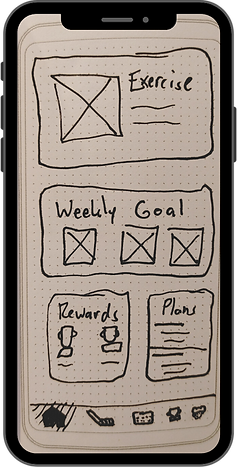
Low-Fidelity Wireframes
In order quickly conduct Usability Tests, I drew initial wireframes with pen and paper.
The wireframes were based on the user stories and user flow above which reflected the requirements of the project brief and incorporated the specific needs of hockey players. Because Playmaker is a responsive web application, a "mobile-first design" process was employed.


Key Actions
Usability tests were conducted with two participants from the Prague HASA Stars ice hockey team. In the wake of the COVID pandemic, I gathered two key insights:
• Players need exercises and workouts that can be completed at home due to the limited ice time available.
• Players want to be able to receive feedback from peers and experts because it can be difficult to self-assess the techniques used in various hockey fundamentals.
Therefore, I assigned "Key Actions" to each screen as the fidelity was increased from low-fidelity paper sketches to mid-fidelity digital wireframes.

Applying a Mobile Grid
The first step for increasing the fidelity of my wireframes to apply the appropriate grids to use for the design. Because Playmaker is a responsive web application, I decided upon a 12-column that would be utilized across all screen sizes.

Mid-Fidelity Wireframes
After a responsive grid was applied, the wireframes were then crafted in digital, mid-fidelity by using Adobe Xd. I was also able to establish the initial padding and stack dimensions which would evolve along with the increase in fidelity as the project developed.


Mood Board
When creating this mood board, I first considered what colors are most often associated with hockey. My mood board encapsulates the grittier, hard-working side of the game.
Black and red naturally lend themselves to hockey as the colors of the puck and nets respectively.
It is no wonder teams like St. Cloud State and the Carolina Hurricanes use these colors. Furthermore, a study conducted by Stijn V. Mentzel in 2019 yielded this interesting finding:
"The results showed a significant color effect for speed; runners depicted in red were perceived as running at higher speeds compared to blue."

UI Elements and Style Guide
As the fidelity of wireframes were increased to high-fidelity mockups, it was vital to establish a style guide with consistent UI assets which could be applied at multiple breakpoints in accordance with "mobile-first design" principles. The style guide includes guidelines for typography, color, imagery, and UI elements.
It was vital to establish a style guide with consistent UI assets which could be applied at multiple breakpoints in accordance with "mobile-first design" principles.


High-Fidelity Mobile Mockups
Using the established style guide, high-fidelity mobile mockups were crafted as the mobile-first reference for larger breakpoints. Furthermore, the mockups were prototyped with interactive and animated elements to create a sense of realism in the final design.


Interactions and Animations
The highlight of this project for my personal growth as a designer was learning how to create and incorporate animated interactions into my designs.
Adobe Xd makes it easy to bring designs to life with their "Smart Animate" feature, but I also invested hours of my own time to watching videos and experimenting on my own to add realism to the Playmaker prototype as you can see below.

Fluid Grids for Different Breakpoints
Following the principles of "mobile-first design," the final step in designing Playmaker was to create mockups for tablet and computer screens. The first part of this final stage was applying the 12-column grid to the larger screens.
When selecting the sizes for the breakpoints, I referred to Foundation and Bootstrap guidelines for reference.


Tablet and Desktop Mockups
With the 12-column grids applied to the breakpoints of tablet and desktop screen sizes, I implemented the rules established within the style guide to create high-fidelity mockups. Several key screens were selected to expedite the process of adapting the design.
The rationale for each selected screen was how often the reusable UI assets appear on other screens in the prototype. For example, the 'Home' screen displays various UI elements which are key features of other screens so it was important to understand how they would look when scaled up to larger screen sizes at various breakpoints.


Conclusion
Designing Playmaker was an experience that afforded me the opportunity to learn how to create a realistic responsive web application while incorporating UX design processes such as writing user stories, creating user flows, and conducting usability tests with real hockey players. More importantly, it allowed me to flex my creative muscles in ways that I had never tried before.
The most valuable skills I learned in this process were how to properly apply grids and padding to my screens, designing my own UI assets, incorporating animations and interactions, and the impact of well-selected colors and imagery in a user interface. I look forward to continually refining and applying these newly acquired skills as my career progression continues.
